Visualization Critique and Redesign
COVID-19 Modeling
Nathanael Jenkins, | naj20@mit.edu
Warning! Dark mode is active. I recommend reading this article using light mode (toggle at the bottom of the page), since images in this report do not display well on a dark background.
Visualization Critique
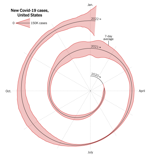
Read: Visualization Overview
From this visualization, I identified the following insights:
- Large peaks in cases are evident in January 2021 and September 2021.
- Smaller peaks are also visible in August 2020 and May 2021.
- Following the May 2021 peak, cases receded to a very small number.
- Following the September 2021 peak, cases did not recede back to small levels, but remained relatively high.
- Case numbers in winter 2020/2021 appear to fluctuate more than at other times.
- Over 2 years, the 'background' number of cases has increased.
- The peak in January 2022 has the largest number of cases, and appears to still be increasing rapidly.
Critique: Visualization Analysis
The context of this visualization is an article about the rapid spread of the Omicron variant in January 2022 and how it could behave in the future. The author discusses how case numbers have risen at an unprecedented rate, but he also discusses the important difference between cases, hospitalizations, and deaths. Overall, this visualization does a good job of conveying the key point that Omicron was spreading faster than any other variant; placing this data at the top does highlight the intended message to the audience, while the spiral, and the arrows next to the year labels, guide the audience to read the design from the center, working outwards. Previous outbreak 'waves' are identifiable and the visualization is relatively free of clutter. However, the title fails to explain how 'cases' were defined (is it reports, positive tests, or hospitalizations?); since the audience is non-expert, this is not necessarily bad. The encoding of case numbers as a position on a common scale is effective and the angular scale for month allows readers to compare trends over years while placing data for each month side-by-side for easier comparison.
While this encoding is clever, the use of a spiral does add some confusion. Intuitively, one might expect the width of the spiral to scale down as it approaches the center, but the cases are plotted on a constant scale, which could make it more difficult for readers to precisely understand the relative differences between each year for a given month. It is also more difficult to understand the data from 2020 because it is plotted over a smaller total length, so it has reduced temporal resolution. Interpreting the positions of years and months took me several seconds of attentive processing, since this layout is not familiar, and only four of the months were labeled. It was not immediately clear where one year ended and another began. The author discusses how reported case numbers are delayed over holidays like Christmas, but this insight is somewhat obscured by the spiral; the use of a spiral also means that the inner and outer lines look like they follow different trends when they are in fact representing the same data. The visualization does not effectively use color, which could have been used for gestalt grouping by adding a color scale to the case data. The layout and typography are otherwise clear, although by joining the month lines in the center Intuitievly, I would read the month lines as a polar scale (i.e. further from the center means something, and July is the opposite of January), but attentive processing reveals that this is wrong.
Redesign: Sketching
Sketch 1: Similar Format, Subtle Changes
Sketch 1
Changes and rationale
1. The title now explains that cases represent reports, not hospitalizations.
2. The radius at 2020 has been increased, so that it is easier to read that data.
3. I added more month labels, and highlighted the line dividing each year.
4. Month lines are separated in the center, so they are not confused as continuous.
5. A color scale has been added to introduce gestalt grouping.
6. I removed the inner spiral plot to avoid confusion with the outer plot.
7. I was hoping this sketch would communicate more clearly the same key point (rapidly increasing cases in 2022).
Evaluation and next steps
1. The key point remains highlighted at the top of the visualization.
2. The color scale is effective at drawing attention to key parts of the visualization.
3. By keeping the spiral pattern, there is still some scope for the confusion explained in the original critique.
4. This visualization remains (relatively) free of clutter and aesthetically appealing.
5. This shows that the visualization could be improved without significant changes to the visual encoding.
Next, I'd like to explore more drastic changes to the visual encodings.
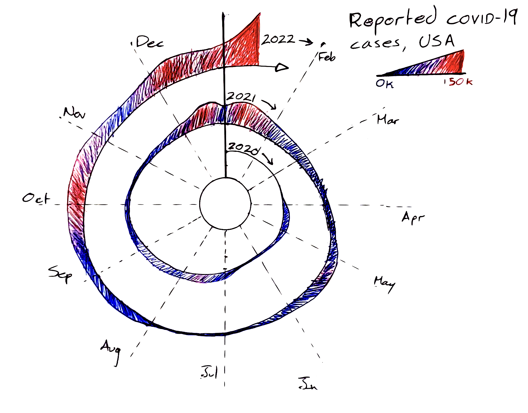
Sketch 2: Similar Encoding, Virus-Shapes Visualization
Sketch 2
Changes and rationale
1. All of the changes described in sketch 1 have been kept, except the color scale.
2. Year encoding has been changed from spiral distance to color. This is possible without excessive occlusion because the number of cases increases over time, and there are only 3 years of data to overlay.
3. Month encoding remains the same (radial), but this is formatted more like a 'clock' which non-experts might find more familiar.
3. Labels have been added to highlight key events. This provides additional context to the audience and is formatted to make the visualization look like a virus, adding to its visual appeal. The labels are color-coded by year.
4. I was hoping this sketch would communicate the same key point as well as additional contextual information.
Evaluation and next steps
1. I like the virus-like design of this sketch and feel that it could be more intuitive for non-experts than the spiral design.
2. The labels provide useful context, but do make the visualization more busy. This is a trade-off.
3. As with all of the visualziations so far, the delay in case reporting around Christmas 2020 is somewhat hidden (although this is not a key point of the visualization).
4. The use of a separate color scale for 2022 highlights the key point of the visualization even better.
5. While this visualization looks pleasant, familiarty with polar coordinates remains lacking in non-expert audiences, raising the question of whether a more conventional, cartesian layout could be more effective.
6. This particular choice of color scheme provides contrast between each year, but the 'flow of time' is not implicit in the colors. Using a more subtle change in color and brightness (for example, light pastel red to medium red, to dark red) could better convey the temporal nature of the color scheme.
Next, I'd like to explore a more familiar/ conventional layout using cartesian coordinates.
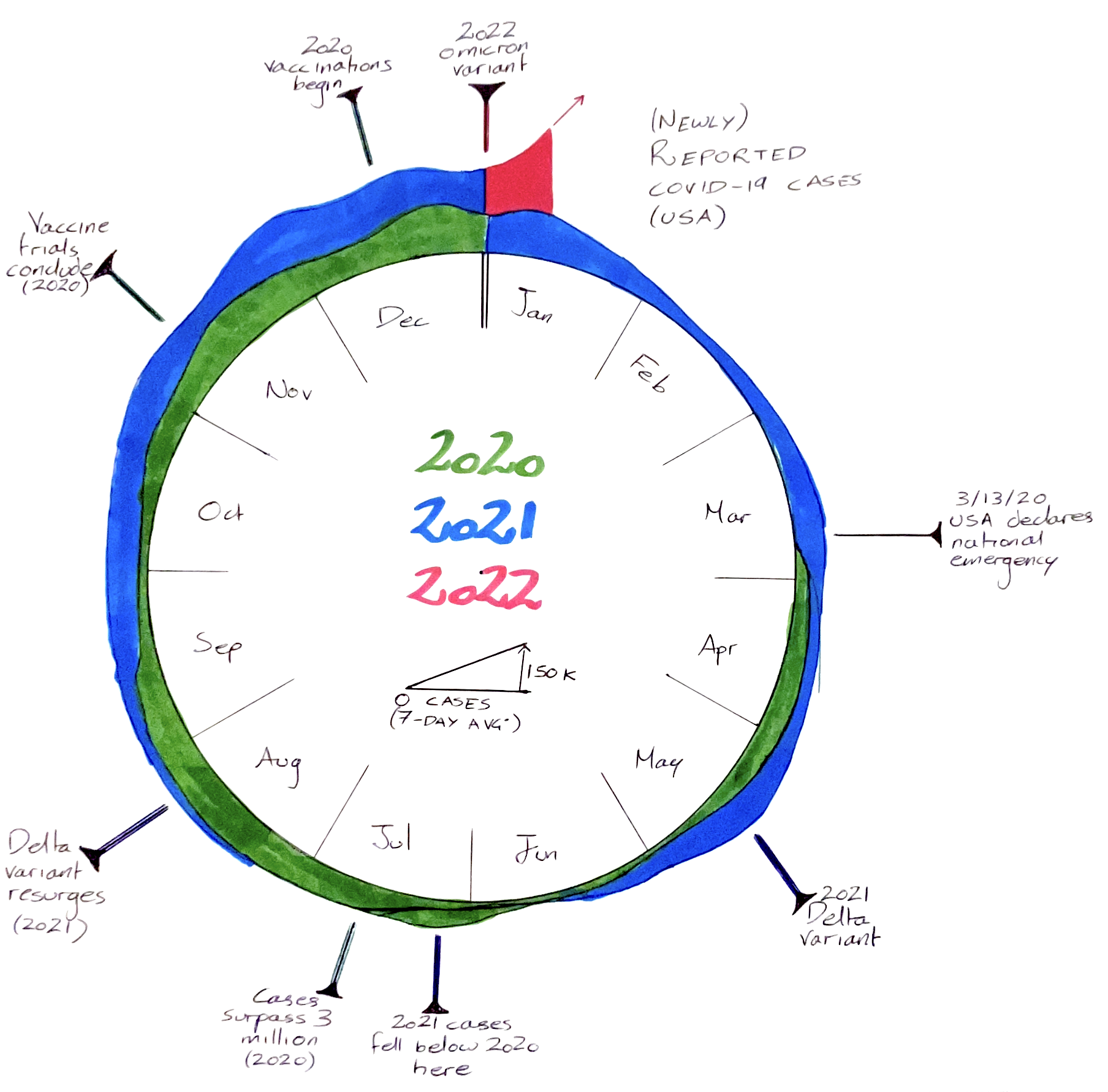
Sketch 3: More conventional encoding
Sketch 3
Changes and rationale
1. This sketch experiments with new month and year encoding, in a grid format, which might be more familiar to readers than the radial encoding.
2. Instead of overlaying several lines, years were stacked on top of each other.
3. The stacking allows for boxes to be color-coded by the number of cases.
4. The line plot show case numbers is clear and simple to interpret.
5. The title make the source of the data clearer.
6. Symbols encode the gradient of the line, to try to better highlight trends.
7. I was hoping this would provide a more familiar encoding/ layout for non-expert audiences.
Evaluation and next steps
1. While the layout is more familiar, it also introduces lots of blank space (e.g. most of 2022).
2. The gradient symbols over-complicate the diagram and make it more difficult to interpret. I regret adding these.
3. The color coding highlights substantial waves of cases (similar to the color coding in sketch 1).
4. This sketch is lacking a legend for the color scale.
5. The key point is much less clear in this visualization, since it is placed at the bottom left, and seems detached from much of the rest of the data.
6. The delay in reporting around Christmas is most hidden in this sketch.
7. Overall, this is my least favorite sketch.
8. Overlaying the years would probably have been more effective than stacking, but it wouldn't solve all of the problems with this layout.
Next, I'd like to re-visit the more aesthetic 'virus-shaped' design (sketch 2), and refine it using the learnings from all of my sketches.
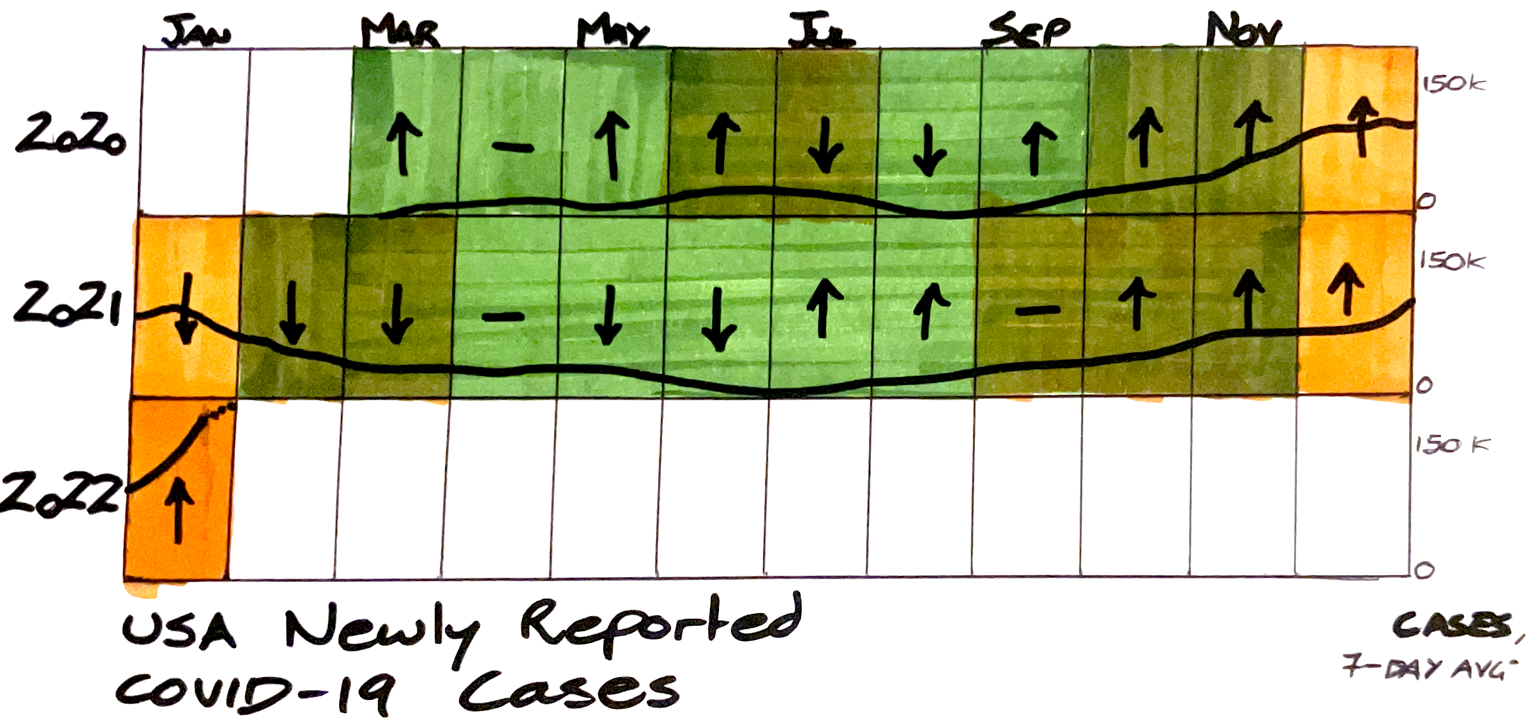
Redesign: Final Visualization
Final Write-Up
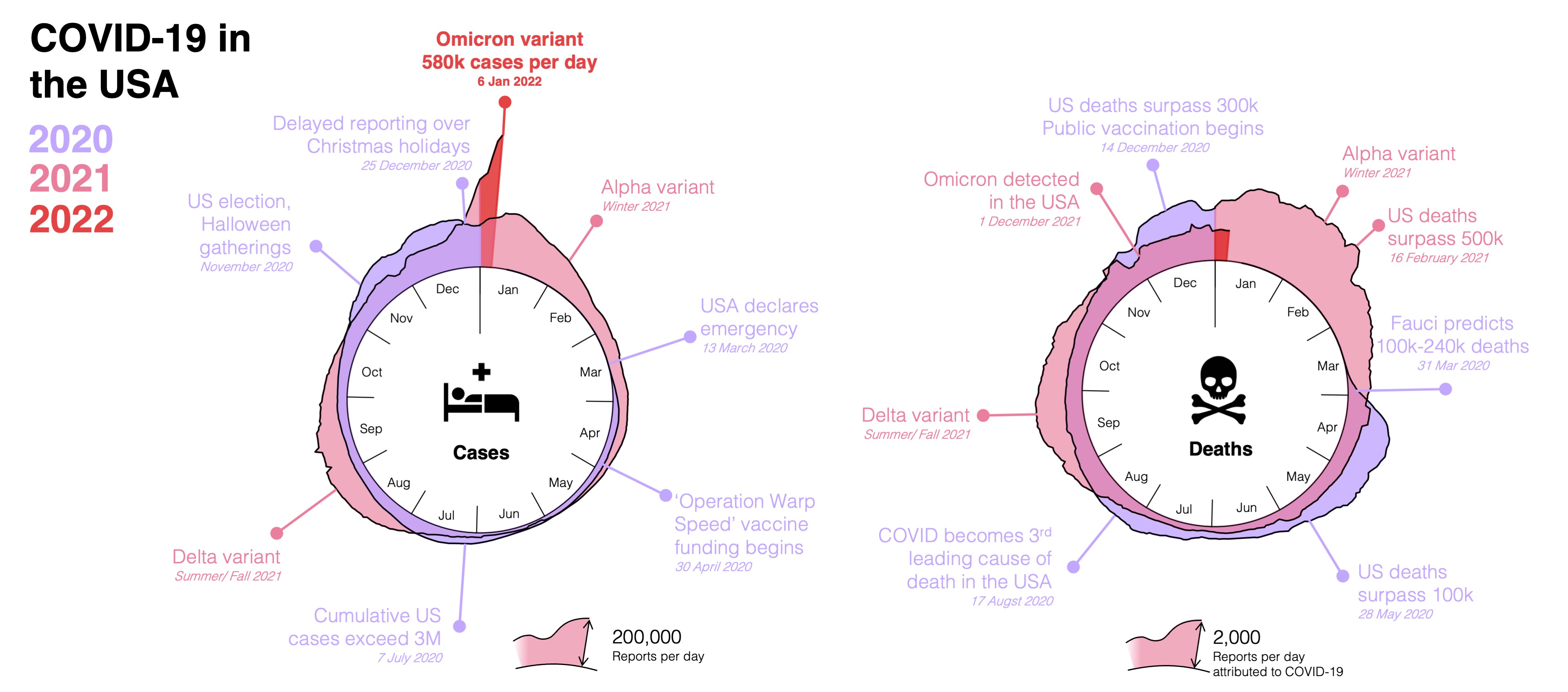
This visualization aims to communicate more points from the article discussion and present a balanced view of the potential impacts of Omicron. It highlights the unprecedented spread of the variant, but the addition of death data balances the extreme spike in case numbers. To easily discern between cases and deaths, icons compliment text labels. The visualization aims engage the non-expert audience by using virus-shaped graphs. The cyclical date encoding has been kept, allowing for easy comparison between different years and color is used to encode each year, instead of the potentially confusing spiral. The color encoding also helps to highlight data from 2022 (bright red), however this scheme could be confusing for colorblind readers. I also wanted this visualization to provide more context to the reader, so added labels with key events based on CDC records. This is a trade-off, since it adds more clutter to the visualization, but it helps the reader to understand how previous outbreaks behaved, which better frames the concerns about Omicron. The month dividers have been separated and arranged in a more clock-like fashion, with a longer divider at the top where the year changes.
This design addressed many of my critiques, especially removing the confusing spiral encoding and providing more context. The legend more clearly explains how 'cases' and 'deaths' are defined. Mention of 7-day averaging is removed from the plot, but included in the caption (since it is unlikely to be of concern to the layperson). All months are labeled, and the additional event labels help provide context, at the cost of a more busy-looking graph (which likely requires more attentive processing than the original). The circular axes remain more difficult to interpret than a conventional linear axis, but this choice enabled the virus-shaped effect. Occlusion does make it more difficult to interpret the data, especially when case and death numbers are small, although these regions are not particularly important. The different scales, while annotated, are also not immediately clear to the reader, who might be inclined to think that deaths exceeded cases; in reality, the number of deaths is 100 times smaller than the number of cases, so deaths would not be visible if both graphs used the same scale.